
It is often possible to replace large tables with much smaller tables that summarize the key patterns in the larger tables. The two most useful ways of doing this are to calculate averages and correlations of categorical variables. There are other useful approaches.
Using averages instead of categories
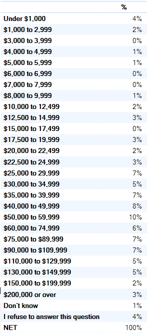
Consider the table below, it contains a lot of information. But, the sheer quantity of information makes it hard to get a feel for what it says in total. Rather than show the percentage of people in each of the income brackets, in some situations a more efficient summary is to just report the average income, which in this case is $63K.
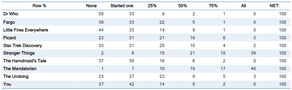
As a second example, consider the grid below, which shows the frequency of watching episodes of 10 TV shows. The table contains 70 numbers. With a bit of effort, we can see that The Mandalorian is the most-watched of the shows, closely followed by Stranger Things, with Picard in a distant third place.
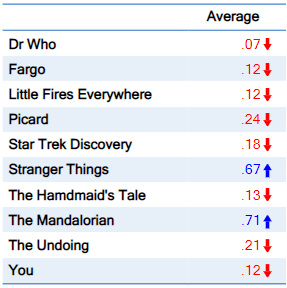
By contrast, the table below has been created by recoding the categories and calculating the average of the variables. It shows 10 numbers instead of the 70 numbers in the table above. This substantially reduces the time taken to digest the data, allowing us to easily see that The Mandalorian, closely followed by Stranger Things, are the most popular programs.
Using correlations instead of crosstabs
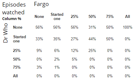
An even more powerful example of data reduction involves the use of correlations. Consider the table below which shows viewing of Fargo by viewing of Dr Who. Looking in the top-left corner, we can see that 56% of people had not watched Fargo and also not watched Dr Who. Reading across the row, we can see that there is no trend in the data: it seems that there is no relationship between viewing Dr Who and Fargo. To work took quite a bit of effort. Including the row and column headings, the table has 48 cells. By contrast, if we instead compute the correlation between the two variables representing the viewing of the two programs, we calculate it to be 0.05, which is very close to 0 and allows us to quickly see that there is no relationship between the viewing of the programs.
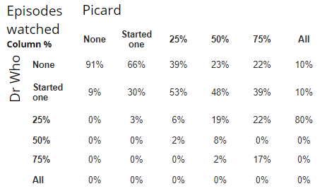
The table below shows the relationship between the viewing of Dr Who and Picard. If we read across the top row we see that there is a correlation between the two programs. However, we can much more quickly work this out by calculating the correlation, which is in this case 0.57.
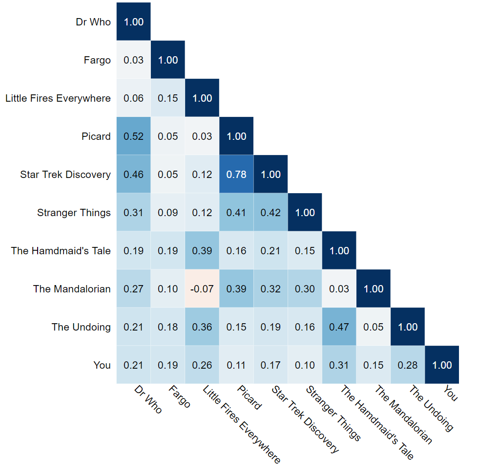
To approach the benefit of summarizing crosstabs as correlations, consider the problem of working out what patterns exist in viewing between all 10 programs. There are a total of 45 pairs of crosstabs between the 10 shows (i.e., show 1 and show 2, show 1 and show 3, etc.). Each of the tables contains 48 cells, giving us a total of 2,160 cells. By contrast, when we calculate the correlations, we only need to look at 45 numbers in the correlation matrix (we can ignore the 1s in the main diagonal). That's a data reduction of 98% and a time saving of likely even more.
Looking at the correlation matrix allows us to quickly see interesting patterns, including:
- As a general rule, everything is correlated with everything else, suggesting that the key difference between people relates to how much TV they watch (some watch lots of everything, whilst others watch a little TV at all).
- The Mandalorian and Little Fires Everywhere have the only negative correlations.
- The strongest positive correlation is between Picard and Star Trek Discovery, which is not surprising as they are in the same universe.
Other useful summary statistics
Percentages, followed by the average, and correlation, are the three most useful summary statistics in survey analysis. However, there are many other useful ones, including:
- The top 2 box score
- Index scores
- Share (e.g., the share of viewing, the share of consumption)
- Standard deviation
- Variance
- Median
- Quartiles
- Gini coefficient
- R-squared
- Regression coefficients,
- Elasticity (own, cross, arc)
- Shapley important scores
Comments
0 comments
Please sign in to leave a comment.