
Indifference curves are a way of showing relative preferences for quantities of two things (e.g., preferences for price versus delivery times for fast food). The contour plot below shows indifference between price and meal quality, from a choice-based conjoint study of home delivery preferences in the United States.
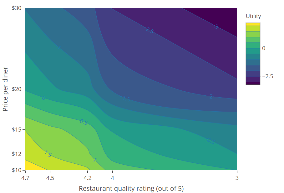
Ths contour plot is read as as follows:
- People prefer low prices and high quality (i.e., the utilities are highest at the bottom-left and lowest at the top-right).
- The bottom-right corner shows that the utility for a restaurant with a quality rating of 3.0 and a price of $10 per diner, has a utility of around about 0 (read from the legend).
- If we follow the curve from the bottom-right corner up to where it is at a restaurant quality of 4, we can see that this equates to a price of around $15. This tells us that:
3/5 quality + $10 = 4/5 quality + $15. Putting it a different way, it tells us that improving quality from 3 to 4 out of 5 is worth about an average of $5 to the average diner. - Following the curve all the way to the left of the plot, we can see that:
3/5 quality + $10 = 4/5 quality + $15 = 4.7/5 quality + $20 - The sweet spot is to have price less than $20 and quality more than 4. It’s impossible to have a high utility without both of these.
Comments
0 comments
Please sign in to leave a comment.