
Continous scale analysis of the Kano model first calculates functional and dysfunctional scores for all the attributes and then presents them on a labeled scatterplot.
Calculating the functional and dysfunctional Scores
The functional and dysfunctional scores are calculated for each attribute by:
- Recoding the variable sets for the functional and dysfunctional measurements using the values shown below (e.g., if a person said I like it for the Functional question for an attribute they are assigned a value of 4 in the variable representing the functional question data for that attribute)
- Calculating the average of the functional and dysfunctional variables for each attribute.
| Functional | Dysfunctional | |
|
I like it |
4 | -2 |
|
I expect it |
2 | -1 |
| I am neutral | 0 | 0 |
| I can tolerate it | -1 | 2 |
| I dislike it | -2 | 4 |
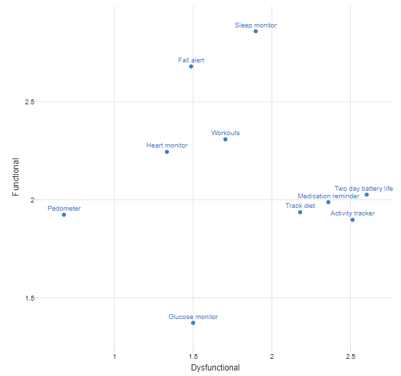
Labeled scatterplot
The functional and dysfunctional scores are plotted on a labeled scatterplot, such as the one below, creating another variant of a Kano diagram. However, whereas we can meaningfully label the quadrants using the Satisfaction Coefficients Analysis of the Kano Model, there is no real basis for doing so with the continuous scale analysis. That is, the precise meaning of the points on the plot is difficult to discern from the plot alone. For example, in the plot below, Pedometer has a score of 2 on Functional, and this could mean that, for example:
- Almost everybody selected I expect it.
- Around 50% of the sample said I like it and 50% said I am neutral.
- Around 2/3 of the sample said I like it and the rest said I dislike it.
The satisfaction coefficients approach does not suffer from this limitation.
Comments
0 comments
Please sign in to leave a comment.